The Cricket Crest: From Club Mark to Shared Symbol
Learn how a cricket crest turns shapes, initials and local motifs into a usable club identity, and how to read design choices without guessing at history.
The common mistake with a cricket crest is to treat every bat, crown or shield as a coded piece of club history. That can turn a useful visual mark into a story built on guesswork, and it obscures the more reliable point: crests help people recognise a club across changing settings. A cricket crest may appear on a cap, a noticeboard, a fixture card or a social post, carrying identity even when the people viewing it do not know its origin.
What does a cricket crest represent?
A cricket crest represents a club by giving its name and identity a repeatable visual form. It can make a badge recognisable on clothing or printed matter, but its shapes do not automatically disclose a club’s founding story or values.
The distinction is between recognition and meaning. A monogram may be legible as the club’s initials; a shield may frame that monogram; crossed bats may signal cricket. Those readings are plausible because the forms are familiar, not because every club has formally assigned them the same meaning.
A crest can also create a point of belonging. Members may encounter it on a cap or team sheet long before they can explain its design. Its repeated presence makes it a shared sign, while the club’s own customs and accounts supply any specific meaning attached to it.
Which shapes appear most often?
Common crest shapes include shields, circles, lozenges and open-sided forms. A shield gives the mark a clear boundary and can hold several elements; a circle can feel compact and work well as a patch. Neither shape has a universal cricket definition.
Designers often pair a container with a small number of motifs. These might include:
- Initials: a compact way to identify a club, especially where its full name would be difficult to fit.
- Bats and balls: direct references to the sport, with crossed bats suggesting equipment rather than a specific club history.
- Stumps: a recognisable cricket object that can stand alone or sit behind lettering.
- Local forms: a leaf, bird, bridge or other place-linked image, if the club has chosen to include one.
- Stars, crowns or wreaths: familiar decorative devices whose significance varies from one design to another.
Colour adds another layer, but its interpretation also depends on context. A pair of colours may be associated with a team through clothing or printed materials; that does not establish why those colours were chosen. If a club’s own account is unavailable, describe what is visible rather than supplying an origin story.
How can a crest stay legible?
A crest stays legible when its main features survive at the size and in the materials where people encounter it. Fine lettering and narrow outlines can disappear on a small embroidered cap badge, while a detailed illustration may become indistinct when reduced for a fixture list.
Useful design checks include:
- Can the club’s initials be distinguished from the surrounding shape?
- Does the central motif remain recognisable without colour?
- Are letters spaced clearly enough for embroidery or rough printing?
- Can the mark be reproduced as a single-colour version?
- Do outlines and small gaps remain open when the design is reduced?
- Does the crest still read as one mark when seen at a distance?
These checks are not a demand for extreme simplicity. A crest can contain detail if its main silhouette and identifying feature remain clear. What is usually not worth the effort is polishing tiny ornament that vanishes on the actual objects the club uses.
Why do club crests change?
Clubs may revise a crest to make it easier to reproduce, to accommodate a changed name, or to give different materials a more consistent identity. A revision can preserve a familiar motif while simplifying its outline or adjusting lettering.
Changing a mark can also raise questions of continuity. Members may recognise an older badge even if a newer version is more practical for digital use or stitching. Keeping an archival version alongside the current mark can help distinguish the design now in use from versions found on older materials.
There is no single correct way to handle a revision. A club might retain its core colours and initials while redrawing the surrounding border, or it might keep the crest intact and create a simplified companion mark for small applications. The choice depends on what the club wants to preserve and where the design needs to work.
How should you read a crest?
Read a crest first as a visual arrangement, then separate observation from interpretation. You can identify its visible elements with confidence; claims about what those elements mean need support from the club’s own explanation or records.
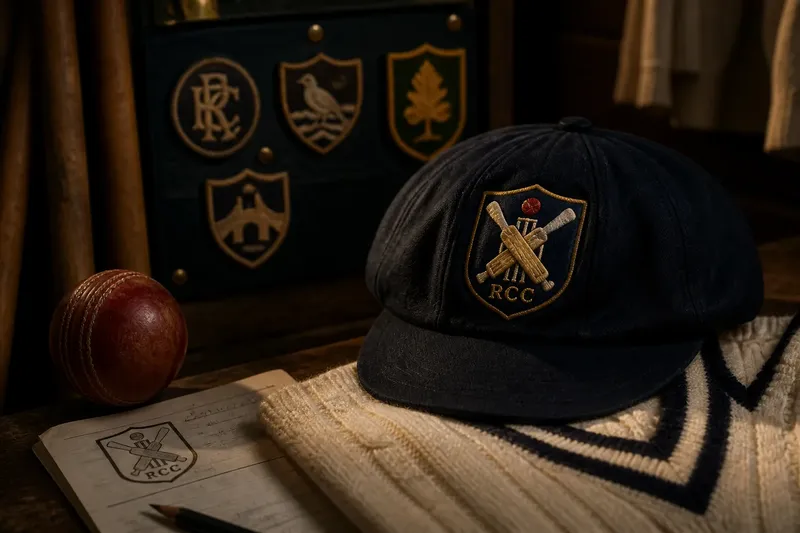
Say you see an invented club badge with a blue circle, two crossed bats and the letters “RCC”. You can describe the circle, bats and initials, and say that the bats make the cricket connection explicit. Without an account from that invented club, you should not claim that blue refers to a local river or that the initials commemorate a particular founder.
This approach is useful when comparing badges. You can note that one club uses a shield and another a circle, or that one uses lettering as its main feature while another foregrounds equipment. Those comparisons describe design choices; they do not rank the clubs or reveal their histories by themselves.
What questions help interpret a crest?
Does a shield mean a club is old?
No. A shield is a familiar frame, not proof of age, status or a particular tradition. To establish a club’s history, look for an account from the club rather than inferring it from the outline.
Do crossed bats have a fixed meaning?
Crossed bats commonly make the sporting reference easy to recognise, but their precise significance varies. Unless the club explains them, treat them as a cricket motif rather than a claim about a specific event or value.
How can I tell whether a crest is a club’s official mark?
Compare it with the mark used on the club’s current materials or its own published identity guidance. A similar badge on an old cap or an informal graphic may be a past version or a local adaptation, not the current official design.
Can a simple crest still feel distinctive?
Yes. A distinctive combination of initials, silhouette, spacing and one carefully chosen motif can be recognisable without a crowded set of symbols. Simplicity works best when it reflects deliberate choices rather than removing every detail that carries local meaning.
Where does the shared symbol live?
A crest becomes shared through use: on caps, shirts, letterheads, pavilion signs, fixture cards and digital announcements. Each setting asks something different of it. Stitching favours sturdy shapes, while a printed notice can accommodate smaller lettering; digital use may need a version that reads against both light and dark backgrounds.
Consistency does not require every appearance to be identical in scale or colour. It means the recognisable features remain stable enough for people to connect the versions. Where production requirements or a club’s own guidance affect the choice, follow those requirements rather than improvising a new interpretation.
The cricket crest is therefore both a design and a social object. It gives a club a visible sign that can travel between people and places, while its particular story belongs to the club that chose it. When reading or redesigning a cricket crest, begin with what can be seen, ask what the club says it means, and let the distinction keep the symbol both clear and honest.